How our Road Signs Came to be
“It is sad but true to say that most of us take our surroundings for granted… Direction signs… are as vital as a drop of oil in an engine, without which the moving parts would seize up; one can picture the effect of the removal of this category of information on drivers in a busy city. It is a need…with more influence on the appearance of our surroundings than any other”

We take so much of our urban environment for granted yet we rely on a carefully planned system of street & road signs to enable us to navigate – most of which we would only notice if they suddenly weren’t there.
Industrial development and the rise of travel led to the necessary creation of a system of road signs in the UK. Various 19th century cycling organisations had begun putting up danger boards to warn their members of road hazards, before then there was nothing!
This was to be repeated with the advent of the motorcar. In 1903 four national signs were created, set ‘8ft from the ground and 50 yards from the reference point’. In the 1920’s these hazard signs began to use symbols instead of text and the era of the road sign pictogram began.
The field of semiotics is a fascinating backdrop for how we perceive language and meaning – and what this means for the graphic designer who’s job it is to create a visual language detailed enough to convey complex information yet simple enough to be read by anyone from any culture. Pictograms must be immediately decipherable, internationally recognisable and independent of culture; their unambiguous meaning must be self explanatory, which is quite a task at 70 miles an hour on a motorway!
Following an innovative project by designer Herbert Spencer - who photographed every road sign between Marble Arch and Heathrow to illustrate what a mess they had become - the government established the Worboys Committee to review signage on British roads.


Until that point, signs were often an afterthought by the engineers who had constructed the roads but, with the rise of cheaper cars, there was an increasing amount of traffic on the roads.
In a radical move, the government asked graphic designers Jock Kinneir and Margaret Calvert to produce signs that could be read at speed,1 it was their job to produce a unified system to replace the dangerous plethora of signs that that had sprung up over the country.
As Calvert later said, “When you design road signs you have to start from scratch… We looked at what they already had and then started drawing letterforms in terms of making it readable for the driver. It’s all about asking the right questions and knowing whom you are designing for.”
Their new visual language simplified signage using pictograms and minimal text. Letters were placed on a grid to enable easy reading at speed. Previous capitals were turned into upper and lower case and a new sans serif typeface was developed Transport later followed by Motorway. They say that many of Calvert’s pictograms were based on her own life – the little girl in the children crossing sign is from a picture of her as a child.

Similar to the London Underground map (link to our blog post), the UK road sign system has been used around the world, showing the pioneering nature of so much British graphic design. Many other places, such as the Middle East, have adopted the Transport typeface with local adaptations:

Kinneir & Calvert’s visual language is so robust, it has been used continually ever since, for example on the Government’s wesbite where it forms very easy to read web pages. However, our favourite has to be Swindon’s wonderfully named Magic Roundabout – it gives us a headache just looking at it, imagine trying to drive it?

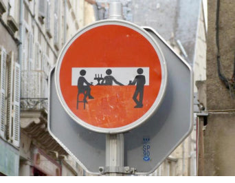
Our Favourite Road Signs from Around the World:
1. A modern adaptation of the school children crossing sign can be seen on the Mexican American border where the very real problem of immigrants being killed whilst running across the highway to evade border control has led to the introduction of these caution signs. The little girl being dragged at the back is almost heartbreaking and shows how much information can be conveyed with the right pictogram.

2. Ignoring a lot of the perceived wisdom of unambiguous signage, the planners of Northern India have turned comedy road signs into an art form:

3. French street artist Clet Abraham has been upsetting town planners for years with his sign hacking – our favourite being this rather civilized scene from Poitiers: