Guest Blog - Colour Inspiration - Kitty Joseph & Marcus Kirby from The Future Mapping Company
It’s never been a better time to reimagine our home spaces as a lot of us make the transition away from offices to live-work scenarios. As we may be spending more and more time in the same space, it’s important that we consider ways to improve our daily experience that give us joy and motivation. Colour can be a transformative tool within the home, and we believe passionately in its power to lift the spirits.
That's why we’ve joined forces with the colourful and like-minded designer Kitty Joseph for this blog. We share notes on colour, how it inspires us, Kitty’s approach to using it in her work, and how she has used it to transform her own live/ work space.
How do you think your work life has been inspired by the power of colour?
KJ: I have always been inspired by the uplifting power that colour combinations can bring, and how they can influence our emotions and interactions with others. This is why I try to incorporate mood-boosting, bold colours into my work, as well as into my live work space. I think colour is all around us, in nature, in man made creations, in the most unexpected of places. I’ve found inspiration in it by allowing myself time to notice, and absorb its influence, and find joy in it - even from a young age just by playing with my crayons and experimenting. You really learn about colour through practice and application which has now found an outlet in my design practice. It’s a life long project and there is always more to learn from colour by living with it. This is in part why I recently launched a series of wall prints and framed prints, as I think that there is a lot of potential in bringing colour into your everyday, not just in your clothes but in your space.
FM: Colour has always been a huge influence in my work. Even at school I remember loving the opportunity to choose colour for everything from a piece of pottery to my work book. I love the excitement of pairing two colours together that at first glance you might not expect to work. This has been with me throughout my work life, firstly on fabric when working as a fashion designer and now on paper as a map maker.
How do you use colour in your own live work space?
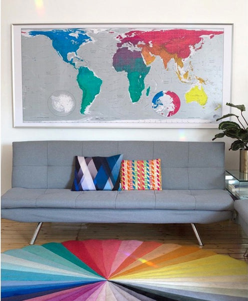
KJ: Colour has always been one of the most inspirational elements to my work, so my studio is bursting full of bold colours which uplift and motivate me daily. With the walls of the studio being white, I chose to bring colour into the space through decor and accessories. From our collaboration with FLOOR_STORY, I have two rugs: the Chroma and the Sky Optick. I also have the Future Maps Classic Map hanging above one of my sofas, which I love not only for the colours, but also the thought and consideration that went into the design; unlike most Western-centric maps, each country on the map is printed at the correct scale. In a time of lockdown and isolation it’s been a beautiful and reassuring presence: to be reminded of the sheer vastness, beauty, preciousness and variety of our planet and its people.
FM: When we took on our current studio it had previously been used as a builders dumping space. They had built a ‘managers office’ slap bang in the middle of the open plan space, built from bits and bobs that they presumably had lying around. We decided to embrace this ugly structure and painted it in a series of bold colour strips. It’s now a very cosy little office for us during the winter months! At home I have an ongoing battle with my partner who loves a bit of black. It has certainly kept things entertaining. Over the years though I do believe she has slowly started to embrace more colour in her life.

Whose work do you find inspires you?
KJ: I find my community and friends are a huge source of inspiration, and I try to fill my space with signs of them. Fred Butler’s [@fredbutlerstyle] exquisite collage cards, a beautiful new collage artwork by Sharon Walters [@london_artist1], photographic prints by Ruth Mitchell [@ruthesmemitchell], all sitting alongside my Floorstory [@floor_story] rugs and my beautiful Future Map [@futuremaps].
In terms of sonic colourings, I find the sounds of independent radio stations such as Worldwide [worldwide.fm] and NTS [nts_radio], with favourite shows by @marshmello7s , @zzzakia , @zeziifore and La Maison Musiq’s [@lamaisonmusiq] Sunday evening show of music and meditation is now essential listening for me. I see a strong connection between the mood boosting qualities of both music and colour, and the way they can fill a space and affect your mood.
My beautiful cushions by friends Magda (@magkag) and interior designer Kit Miles (@kitmilesstudio) also are a daily source of joy. As I spend so much time working, I find surrounding myself with these things are hugely inspiring and comforting.
FM: I tend to complement work from contemporary graphic artists with a trip to the British Museum (@britishmuseum) to look at some old maps for inspiration. This gives me a nice balance but a lot of the time the map data on screen guides me to where I need to be. The lines and space that create the topography on a map are a really inspiring platform for colour. Paul Rand & Massimo Vignelli are two big influences on me and my work.
What do you think the most important thing is to consider when designing a live/work space?
KJ: As I mentioned, I have found that throughout lockdown colour has provided a source of inspiration; this has been incredibly important in a time where we are inside a lot more. Colour is something that I try to work with instinctively from the heart, rather than over analyzing or getting too immersed in theory. I think, as long as it uplifts or inspires you, then you should go for whatever interior design you like! Some interior designers might say “don’t use too many clashing colours together”, but if that’s what you love and find uplifting, you shouldn’t worry about whether colour theory and designers suggest something else. My colourful environment has kept my spirits up without doubt through lockdown, so I believe we should appreciate the intrinsic power of colour and use it to provide us with positivity and inspiration, which we are in greater need of in a time where our lives in the outside world are currently limited.

FM: Art work is important but can be tricky in a live/work space, as it needs to be attractive, homely and add colour, yet still feel serious enough for a professional environment.
A modern map is great for bridging that gap, bold yet factual, striking yet elegant. It also shows colleagues and clients you have an interest in the world around you! Perfect for a home office and living space in need of brightening up.
Whatever you do to make your live/ work space work for you, try to make it so that you can pack away at the end of the working day. The importance of ending the working day and beginning your evening in a live/ work space is crucial to ensure good mental health and home relationships.
Invest in some good storage to help with this, there are some decent and affordable modular storage systems out there, I have always appreciated the classic and iconic 606 Universal Shelving System that was designed by Dieter Rams in 1960 and has been made by Vitsoe (@Vitsœ) ever since. Create lighting that can zone a space, our favourite lighting brand is Anglepoise (@anglepoise) a design classic, good functional design and they compliment our maps brilliantly.